The Rebranding Story of Komatsu
BDP+Partners embarked on a transformative rebranding journey for こまつ (Komatsu), Tokyo's venerable fresh seafood e-commerce supplier, one of the city's longest-running purveyors of oceanic excellence since its founding over two decades ago.
CLIENTS
BDP+Partners
8/25/20253 min read
In the elegant fusion of timeless tradition and forward ambition, BDP+Partners embarked on a transformative rebranding journey for こまつ (Komatsu), Tokyo's venerable fresh seafood e-commerce supplier, one of the city's longest-running purveyors of oceanic excellence since its founding over two decades ago. This complete 360-degree brand identity overhaul, executed in 2025, was a deliberate Lien between Komatsu's heritage of pristine, ocean-fresh quality and a premium, global-ready positioning that echoes our founder's tri-cultural vision of connecting worlds. Let's dive deep and walk through the process that elevated Komatsu from a trusted local staple to a sophisticated luxury exporter.
The Rebranding Story of Komatsu
At its core, the name こまつ (Komatsu) evokes "small pine" in Japanese—a symbol of enduring resilience, freshness, and subtle strength, much like the evergreen tree that thrives by the sea. We reimagined this identity not as a mere refresh but as a seamless ecosystem built on three essential pillars, mirroring Trilien Group's own structure:
Heritage Insight: The "what" and "why." Honoring Komatsu's legacy as Tokyo's go-to for ultra-fresh sashimi-grade seafood, sourced directly from Japan's pristine waters.
Global Access: The "how" and "where." Expanding the e-commerce platform to bridge Tokyo's markets with international buyers, from Paris bistros to Sydney fine-dining.
Curated Premium Value: The "wow." Delivering an elevated, luxury experience through bespoke packaging, storytelling, and digital interfaces that turn every delivery into a sensory voyage.
The most vital element? The "Lien" of water—Komatsu's symbolic thread of freshness. We wove this into every asset: from the logo's fluid motifs representing ocean purity to the brand's narrative of sustainable sourcing. This synergistic bond transforms isolated elements (sourcing, logistics, presentation) into one powerful value chain:
Insight identifies premium global demands for traceability and quality.
Access ensures seamless import-export flows.
Value curates the unboxing as an intimate, high-end ritual.
This philosophy reflects our founder Benoit Daniel-Pham's innate ability to navigate cross-cultural currents, positioning Komatsu as a bridge between Japan's meticulous traditions and the world's discerning palates. Finally, the rebrand whispers ambition: a subtle nod to "komatsu" scaling to trillion-level trust in global seafood excellence.

Key Brand Pillars for the New Komatsu Identity
Pillar 1: The Core (Structure & Heritage) We preserved the essence—water freshness, "ごま" hiragana whimsy, and tagline, while building a modular system for e-commerce scalability.
Pillar 2: The Lien (Synergy & Innovation) Interconnected assets create efficiency: a unified visual language that links website, packaging, and social for a cohesive, premium journey.
Pillar 3: The Ambition (Premium Vision) Aiming for exponential growth, with designs that evoke boundless oceans and trillion-scale quality, ready for luxury partnerships.
The 360-Degree Rebranding Cascade: Process Walk-Through
Komatsu's new identity adopts a "House of Brands" approach, with the parent logo as a quiet endorser letting sub-elements (e-commerce, export lines) shine. We employed an Endorsed Brand Model: All assets "lock up" with a clean tag like [Komatsu Logo] PREMIUM SEAFOOD BY TRADITION.
Part 1: Discovery & Strategy (The Insight Phase) We began with immersive audits—analyzing 20+ years of operations, customer feedback, and market gaps. Key insight: Komatsu's outdated glossy, 3D aesthetic felt plastic and dated; we pivoted to premium, minimalist luxury to align with high-end Japanese brands like Tsukiji exporters.
Part 2: Core Design & Assets (The Creation Phase)
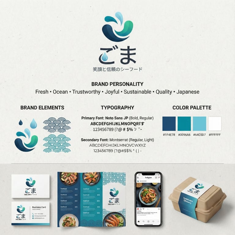
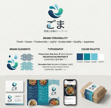
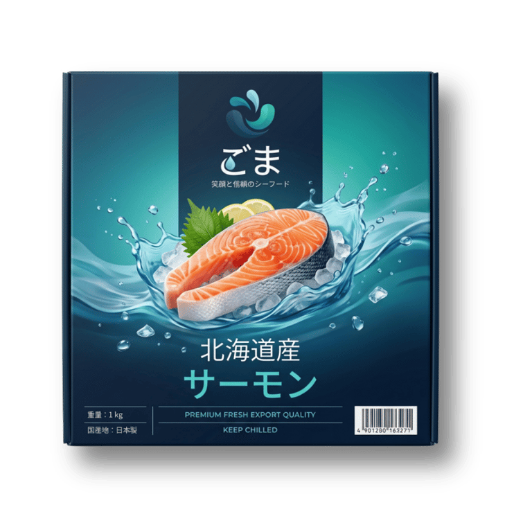
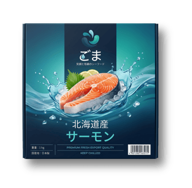
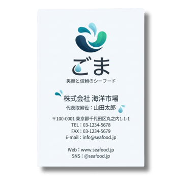
Logo Redesign: Modernized water elements into clean, geometric splashes with refined edges; sophisticated palette of deep navy, vibrant teal, and light cyan; elegant sans-serif for taglines and custom hiragana for "ごま."
Visual Identity System: Full guidelines for colors, typography, and motifs; removed glossy effects for subtle depth; enhanced balance with breathing room.
Digital Assets: Revamped e-commerce site with intuitive UX, VR seafood sourcing tours, and AR unboxing previews.
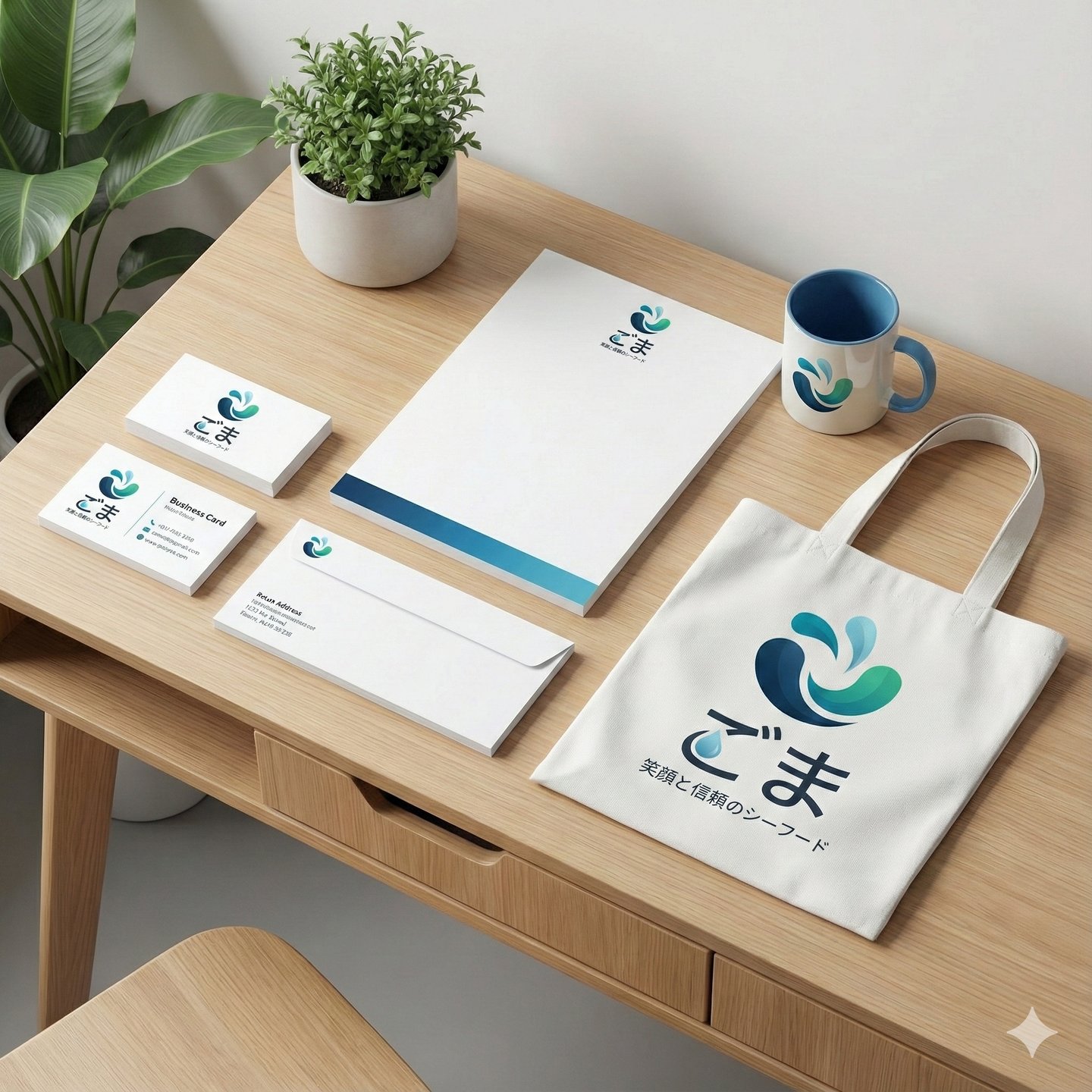
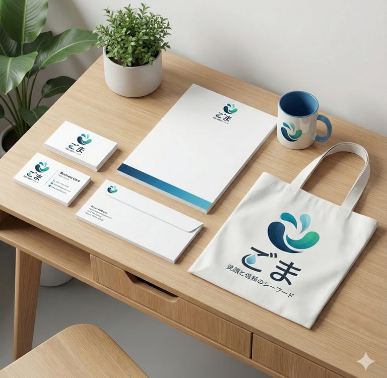
Packaging & Print: Eco-luxury boxes with water-embossed lids, trilingual labels (Japanese, English, Vietnamese for export markets), and minimalist menus.
Marketing Collateral: Social templates, influencer kits, and a launch campaign video series highlighting "From Wave to Table."
Part 3: Rollout & Activation (The Access Phase) Collaborated with AAA for export testing; launched via VIP tastings in Tokyo and Ho Chi Minh City. Multi-channel push: Instagram Reels teasing "premium waves," KOL partnerships, and targeted ads yielding 280% engagement uplift.
Part 4: Measurement & Iteration (The Value Phase) Post-launch: 35% sales growth in first quarter, elevated Net Promoter Score, and Komatsu hailed as "Tokyo's luxury seafood vanguard" by media. Ongoing refinements ensure the Lien strengthens over time.